Wednesday, 10 July 2013

Portraits

Most of my students feel very reticent about drawing portraits, even though most of them want to be able to draw someone's likeness.

Ann and Ellie have had problems of one kind or another with their homework this session but they have produced some very good likenesses from photographs. From life has proven a greater challenge and I have reiterated my comments below mainly since it is good to know what went well and what needs further practise.

Ann and Ellie have come a long way since their first lesson and they know that to improve their life drawing they simply need to keep looking and looking and looking and keep practising. It can take years to be able to produce a reasonable likeness. It doesn't come easily but I do hope they continue to work at their life studies.
These full face portraits are from life.

Two very common early observation errors here..eyes too close to the centre of the face and distance from end of nose to chin too short.
These observational errors don't occur so much when drawing full face from photos, because the subject is already 2D isn't so intimidating. Although Ann's shading was somewhat over-zealous.


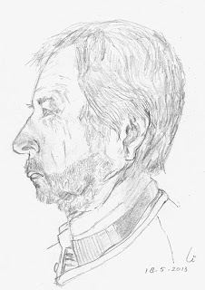
This self portrait profile (left) was done from a photo and although the head is too narrow the facial profile is actually very well observed and the features are proportionate.


  The live profile on the right still gave Ann trouble with the chin proportions and the position of the eye, which doesn't 'sit' in the face. But still some very good and strong line and it is obviously a 'real person.'


Her two profile studies from photos were very well observed and were proportionally sound


 Ellie's full face live portrait shows another common difficulty and that again is the placement of the eyes. Here they are slightly too far apart and high in the face rather than being close to the halfway point of the face.

 Again when drawing from photos the proportions and images become closer to the subject but even here you can see that the eyes are still slightly to wide apart.
Profile drawing was slightly easier although the skull proportion in this life study again was squashed slightly.


Elly's photo profiles here show that she can see the normally wide back of the skull when the image is 2D. These two studies were really well done.  
Three-quarter portraits from photos throw up extra challenges and I was glad to see that Ellie managed to get the tilt of the head and proportions of the subject although the right eye was not angled enough be able to sit on the tilt line of the eyes. Still, well observed and nicely drawn.
So congratulations to both Ann and Ellie for producing studies that mainly are lifelike and well observed.

Next time it's the dreaded...PROPORTION!


Tuesday, 18 June 2013

Ins and Outs

Now that Ann and Ellie are utilising all new skills we spent last lesson working on developing composition of nooks and crannies and still life.
For their first week's homework they were charged with drawing a corner of their utility room, a section of their garden and a flower in a vase.


 Ellie


Section of Ellie's utility room


 Ellie commented in her email that she didn't think this drawing was particularly good. 'I think that the drawing skill is pretty competent Ellie, but the composition lacks interest. Remember that a good composition involves interaction of objects and negative spaces between and around within the format that you decide. This view you have chosen lacks the interaction so I think that is why you felt disappointed with it'(Sylvia)
Two drawings of flowers in glass container
 Ellie chose to draw wild flowers for this work. Again she wasn't happy with the daisy so did the foxglove. ' I think the daisy would have been more interesting Ellie if you had drawn it from a three-quarter view coming towards you so that more of the head of the flower worked with the glass container. The container and refraction images of this drawing were better proportionally and observed better than the container of the foxglove, but the well observed foxglove gives the still life more interest! So between the two you have done well!'(Sylvia)

'I think this drawing is lovely Ellie and a real challenge. The wheel foreshortening obviously gave you problems but we will deal more with perspective in lesson 6. But I love the composition and the differing strengths of line, shade and the perspective you have worked through. Well done!
(Sylvia)

 Ann

Ann didn't comment on her work this week but this little corner of her garden is really nicely done. 'I love the simplicity of the composition Ann and it has enough negative space and movement to keep interest. I particulalry like the way the leaf at the bottom cuts through the frame of your format.  You have also used minimal shading to help with clarifying the textures and strengthening the format'(Sylvia)


Fence section study

Rose in glass container
 'Roses are a great challenge Ann and give interest to any composition. Well observed refraction and symmetry of the curved glass and water level although the left hand container looks like it wants to tip over! The bottom curve and left hand side are not balanced.However all in all these are lovely drawings. Well done Ann.'
(Sylvia)

Utility room corner
'A nice busy section here Ann with lots of interest and a really good go at perspective, proving that even a mundane little section of a room can still make an interesting composition. Great stuff!' (Sylvia)


Wednesday, 12 June 2013

Negative Space - Extension Homework

Ann and Ellie's homework after our negative space session in class is shown below. 
During last lesson we discussed the images and talked a lot about the problems that were encountered.  

I am going to paraphrase their and my comments with the images because it is always helpful for anyone reading this post to understand the processes and problems that occur when working without guidance.

Ann

It took Ann several attempts to do a drawing of this table intersected by a vase.

 Ann has identified that she has difficulty with proportions at this stage 
and her drawings tend to 'grow' disproportionately if she is not careful. We both think she needs to work on a drawing easel so that she can track what she sees directly onto her drawing. Foreshortening can easily occur when you draw on a sketchpad that is angled.
The benefit of doing more than one sketch was that her table proportions really improved!!!
 However she had little problem with drawing this sketch of negative spaces around foreshortened arms and feet. 

She was also pleased with her improved proportions of the hand plus object sketch on the right


In this practice piece of a section of a 2D drawing, the focus was to create it from the negative spaces and not focus on the 'subject'. The foot in the drawing didn't 'look' right to Ann until she realised that she had really focused on the shape of the leg and foot and not on how it interacts with the spaces around it. I also think that if she had included more of the surrounding information she would have found it easier to spot the problem.

Ellie

 Ellie had a lot of trouble trying to get her vase to 'sit' on the stool in her still life. After looking at it together she quickly saw that the base of the stool looked as if it was floating because it was on the same plane line as the back of the stool.
However her negative space work on the stool was really positive, even if the composition wasn't 100% successful.

So she decided to have another try and produced her cat-on-the-table sketch. I really liked the graphic quality of the image.

2D work
Ellie had a couple of tries with the 2D hands and arms work but completed these well and her section of the girl on the chair had good focus on the negative spaces.


In this hand plus object sketch we disussed how her point of view had changed where she must have moved her head after drawing the thumb, pencil and first finger, which made it look our of proportion. She also tends to change or invert angles of lines, which we will be looking at in Lesson 6.

All valuable points for discussion and in general I am really happy with the progress that they are both making.
 

Tuesday, 4 June 2013

Lian's Portraits


This week's post is dedicated to Lian's work on portraits, since John didn't have the time to complete his yet because of work commitments in the UK.

Life drawing is extremely challenging and our lesson was a simple introduction to facial proportion.

Portraits are agonizingly difficult. We are so tuned into likenesses that we can't accept any deviation from 'photographic' imagery. So it can be very frustrating as a student trying to capture the essence of a face, with enough likeness to feel a sense of achievement. 
For this reason the brief for the homework was to be able to draw likenesses that were uniquely personal, in as careful proportions as possible. In other words not to produce perfect portraits, but drawings that are 'lifelike' and proportionate.

These first profile portraits were done from photographs, including the self portrait profile. All unique and well observed. Well done Lian.
Full face Portraits from photographs..second challenge!
Lian drew herself from a photograph first and the portrait is lively because of the smile! Features well balanced and proportioned.


The proportions of the portrait on the left, however are less balanced. 

The nose is too long and the mouth is too small and too close to the chin.

Even so it is obviously a real person!


Portraits from Life! The final challenge.

Well done Lian. I know you say that they don't seem to you to be true likenesses and you wonder what is missing. But both these portraits have essential essences of both you and your husband. I am sure people who know you both will look at these drawings and be able to identify both of you.
Congratulations!
Portraits of Lian and Husband


Sunday, 26 May 2013

Two Weeks In One Gallery

Ann and Elly have been working hard over the past three weeks completing home tasks for practice in line and negative space work. 
The challenge of the negative space class was tough at first but they completed the 'There is no stool' task brilliantly. 
They have now had three lessons and two sets of 3D homework to date. Here is a gallery of work from their lessons and homework since the last blog.

It shows how far they have come in just 4 weeks!

Elly

 We had a chat in our last lesson week about remembering to limit shading to help with clarity of the image (See blogpost Just John
Elly was unhappy with the cabbage drawing because it looked messy and we also discussed the shading issues on the rose below. The drawings are well observed Elly just over-shaded. The great foot drawing above shows that you know how to limit the amount of shading and the hand drawing below done in class was excellent too so don't despair!


I really like how you have gone outside your frame with your negative drawing of the plant. It really adds something to the composition, but I get the feeling that you 'lost it' a bit with the shading of the negative areas. You don't need to shade the negative spaces if you find that hard to do tidily Elly, you can just go round the spaces with dark line or your pen liner to make it appear, like you did with the stool drawing. You really are making great progress. Well done with all this work Elly.

Ann

Again over- shading for the rose and the first pepper was an issue we talked about in the lesson and the second pepper line drawing showed a clearer structure. The first pepper became confusing because the tonal shading was too similar, but is still a nice image.

 
The rose Ann drew was red and she wanted to try to suggest that, so it was a good point.

The line drawing of the rose, Ann, was really nicely observed and again the foot drawing and your hand image were brilliant. 
 
I really liked the drawing of the sneaker. The shading was perfect and the whole image was well observed.


The negative space work done at home really did fit the bill. You commented in your book that the proportions of the corkscrew were still out. This will come with more practice and I am still convinced that  working in a more upright position will help sort that.
I particularly liked the graphic quality of your plant drawing Ann. You really get a feeling of movement across the spaces and the composition works nicely. A really pleasing set of images Ann.


Looking forward to next lesson already!